The Mariposa Program · Case study
WellNest: a free UX teardown of a Base44 app
A health tracker for people living with chronic illness, built in Base44. Its founder asked for feedback on Reddit, so I sent a free teardown.
- Found
- Five fixes
- Shipped
- All five
- Live
- Within 24 hours
- Cost
- Free teardown
- 1
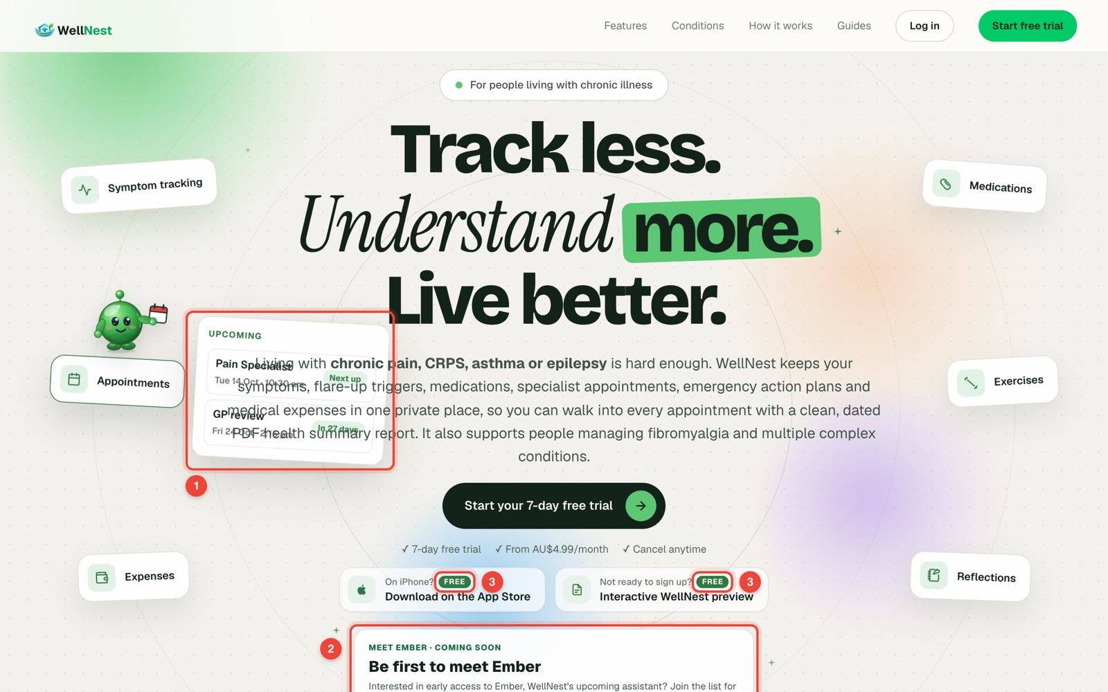
Found: On a laptop, the floating preview cards landed on the headline and the paragraph.
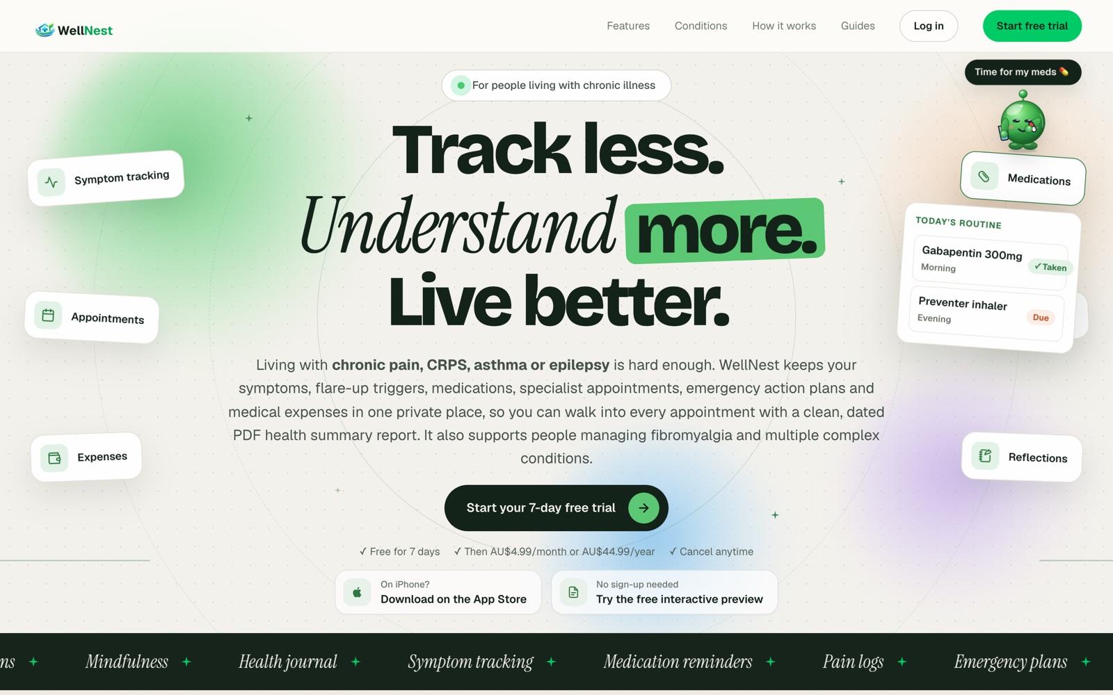
ShippedThe cards moved to the sides, clear of the text.
- 2
Found: A waitlist for a feature that wasn’t out yet sat right under the main button.
ShippedThe free trial is the only sign-up on the first screen.
- 3
Found: Two “FREE” pills beside “From AU$4.99/month” left people guessing what was free.
ShippedOne plain line: free for 7 days, then AU$4.99 a month.
- 4
Found: The link for people managing more than one condition was dark green on near-black, at 1.9:1 contrast.
ShippedLight text at 14:1. Readable text needs 4.5:1.
- 5
Found: In the free preview, the pain slider started at 5 but said “Not selected”, so tapping 5 did nothing.
ShippedThe first tap counts, 5 included.
Want the same for yours?
Request a free teardown